In the previous article I have demonstrated how to create a simple dashboard that monitors accessibility of sources in Splunk. Today I want to demonstrate you how to make any table in the dashboard more obvious and convenient.
Let’s look at my last article and continue to improve the functionality of the table that I got as a result with color table rows.
Creating color table rows in cells
For greater clarity, I’d like to decorate the cells depending on the result of the ‘Minutes_ago’ column: the green color for ‘Minutes_ago’ value from 0 to 10; blue color for range 10-30 and red color for the 30-more range.
Thus, such color differentiation will help Splunk administrators immediately focus on the necessary information in the table and detect all inaccessible sources.
For doing that I need to make javascript customisation. There are a lot of examples described in Splunk 6.x Dashboard example app (https://splunkbase.splunk.com/app/1603/). You can download and install that app to get more helpful information about implementing dashboard elements.
So, in this case, I’m going to use “Table Cell Highlighting” example.
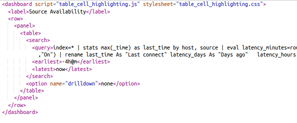
1) Firstly let’s add supporting .js and .css stylesheet to the dashboard. To do this, I need to edit the source of my dashboard:

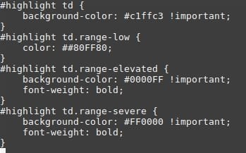
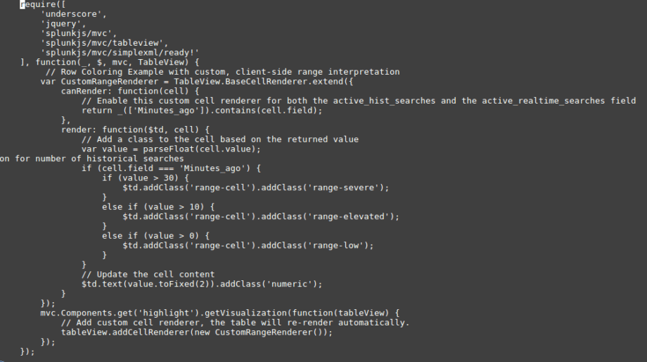
2) Now I’ll create files table_cell_hightlighting.js and table_cell_hightlighting.css.
table_cell_hightlighting.css:

table_cell_hightlighting.js:
Note: Templates for css and js files were taken from the application Splunk 6.x Dashboard example app.
3) At this point, all required files are ready to use. Where should these files be placed? In the static directory of my app. For example, if I used an app called search, I need to place table_cell_hightlighting.js and table_cell_hightlighting.js.css in $SPLUNK_HOME/etc/apps/search/appserver/static
4) After that, the restart of Splunk service is required.
5) As a result, the required table is displayed with colored cells according to the conditions.
In the same way, you can leverage many other visualizations from the application Splunk 6.x Dashboard example app.
This article describes one of many examples of customization of dashboards in Splunk. It is not necessary to use templates or color table rows; you can create your own visualizations, and this makes Splunk unlimited regarding visualizations.


